Google Maps has always been a great tool for getting directions and looking up places you’re about to visit. But did you know that it can do a lot more? Here are three of its lesser-known features that you might find useful in your everyday life.

#1 Get directions for public transport

Screenshot 2014-05-19 15.05.53

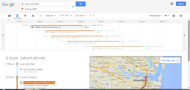
For many major cities around Australia and the world, Google Maps can provide public transport directions. (Melbourne is the only capital city still not on board – sorry Melbournians!)

It’s as simple as going to the site, typing in “<Place A> to <Place B>” and selecting the little train symbol just above the list of directions. Google Maps not only provides the name of the train line or the bus number, it also tells you what time it arrives at your stop.
Note: Only useful if your public transport actually follows the schedule!

I especially love this feature when I’m overseas and have no clue what bus goes where, or which stop to get off. It really helps when I can’t read the language.

It can also provide walking and cycling directions, and local flights. You can find the full list of cities where public transport is covered here.

#2 See real-time traffic conditions

Screenshot 2014-05-19 15.36.06

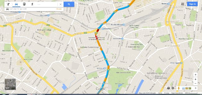
If you’re driving, you can zoom in on the map and see the traffic conditions on your route. Blue means conditions are as normal, yellow means mild congestion, red means congestion, and dark red means you’d better have some good music on your stereo because you’re going to be there a while.

You can also search for traffic near a place by simply typing “traffic near <place name>”. In this case, free-flowing traffic is green instead of blue. It’s very useful when you want to know what traffic is like along your usual routes, so you can detour if necessary.

#3 Explore an area

Screenshot 2014-05-19 15.51.53

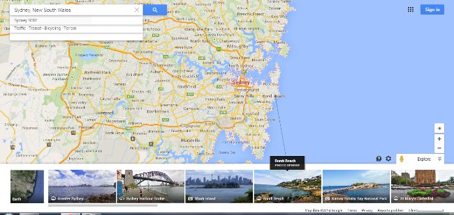
You can choose a city you’ll be visiting (or even your own, if you’re so inclined!) and click on the little photo and arrow icon on the bottom right corner of Google Maps. It’s just below the “+” and “-” buttons for zooming in and out.

This pops up a strip along the bottom of your page which lists many popular sights in the area. You can click on them to see photos of each attraction, and it even draws a line to show the exact location on the main map. It’s a great way to plan a trip, and get an idea of what you want to see. Or for those who can’t afford to travel, it’s also a great way to have a mini-holiday from the comfort of your own home!

What Google Maps features do you like to use, or find particularly useful? We’d love to hear about them in the comments!


Most businesses these days have a website, or a basic online presence. Even people pursuing hobbies will make a website at some point to share what they’re doing. How your website is perceived will have a huge influence on how your business is perceived. But what makes some websites look professional, and others hacked together in a rush?
Here are four fundamental design principles that will help you improve your website. In fact, not only websites, but posters, reports and even presentation slides can be greatly improved if you follow these simple guidelines.

1. Contrast

Make sure there is enough contrast between your elements so they stand out from one another. In particular, be careful with colour. For example, if there isn’t enough contrast between the text and background, it might be hard to read the text.

2. Alignment

If you have more than one element in your design, make sure you pay attention to how they are aligned. Aligning the elements in your design will make your design look cohesive and well organised. If your elements aren’t aligned, they will look scattered and your design will appear messy.

3. Proximity

If you have elements that are related to each other, put them close together. By having the elements next to each other, it will create unity in your design and increase organisation and comprehension. In contrast, if they aren’t related, make sure there is space between them to make it clear they are separate ideas.

4. Consistency/Repetition

The one golden rule of them all is to be consistent. Don’t go crazy with the colours or font choice – try to stick with a maximum of three colours or fonts. Keep to the same colour for the background or highlights. Use the same font for your headings and body text. The consistency and repeated use of the same elements will tie your design together and make it look more professional.
Do you have any tips of your own for a great-looking website? Share with us in the comments!
Peggy Kuo is a programmer who has developed the mobile game Mr. Tiddles, and is working on another. She’s an avid student of design, and you can see what she’s up to at her website.

Featured photo: Xelcise


There are 300 million PowerPoint users in the world and it’s estimated that there are a million presentations happening right now. But most of them are dull or even bad. It’s bizarre and it can really hurt your career.

But it doesn’t have to be that way. Once you have got to the the core of your talk–the message you want the audience to take away–then, and only then, turn to your slide software. Here are two key tips to help you stand out from the crowd.

Think billboard, NOT document

Powerpoint Surgery jpegs for article.008

This is probably the most important thing I can pass on.

People simply try to do too many things with their slides. Fundamentally, slides are for the audience, not for the speaker. Although it’s tempting, they should not be our crutch. Once we understand that they are for our audience, we design them in a bigger and bolder way. Feel free to make a word document to hand out after your talk if you like (although no-one ever reads those documents, in my experience), but don’t make your slides in that way. Build them for the bored bloke in row 33. Nancy Duarte helpfully compared slides to billboards in her book Slide:ology. Imagine you are passing your slides at 50mph on a major road. Could you read them as you drive past? If you can’t they are too complicated and wordy. It’s a simple but effective test for us.

Design your slides, and if appropriate, write some handout notes. But keep in mind that they are two very separate things. If you’re going to produce a presentation slide deck, then do just that–don’t be tempted to make it into a hand-out with a slightly larger font.

Bullets kill

Bullets don’t just kill people, they kill presentations too. Sometimes when I see speakers present a slide with bullet points you can almost feel the people in the room deflate, they may not groan out loud, but they are inside. I’ve heard it said to limit the words on a slide to 33. I’d say 3-12! If you have more than that, then either rephrase, condense or add another slide. Be tough on bullet boredom and the causes of bullet boredom.

Give these simple tips a try this week, and watch your presentations get better and better. Tell great stories, be yourself, and let your slides be your backdrop–not your auto-cue.

Lee Jackson

This article is an exert from Lee’s book “PowerPoint Surgery: How to create presentation slides that make your message stick.” available from Amazon. Lee Jackson is a motivational speaker, powerpoint surgeon, presentation coach and the author of the 2013 book ‘Powerpoint Surgery’. He’s been speaking up front for more than twenty years in many challenging situations. As well as speaking himself, he loves helping other people to speak well too. He is a fellow of the Professional Speaking Association (PSA) and also the president of the PSA Yorkshire region. He supports the New York Knicks, is a former youth worker and was once an award winning DJ. You can get in touch with him here: via leejackson.biz or twitter @leejackson


Just like with a bottle of wine, the quality of your SEO strategy and implementation matters immensely. Choosing a quality bottle of wine over a cheap one ensures you are not left with a hangover. In a similar vein, just because your business employs SEO techniques doesn’t necessarily mean that you’re obtaining maximum benefit. Poor SEO strategies and sloppy implementation can bring hangovers of their own–for instance, in the form of penalties and loss of ranking. Here are some ways in which your business’s SEO strategy can benefit from the wisdom of wine.

Champagne

Champagne is often called upon during celebrations. The popping of the cork occurs with great fanfare, and flutes of bubbly champagne are poured with excitement. However, once the fizz disappears, champagne turns flat quickly. Similarly, coming up with a new SEO strategy and implementing it for the first time can be exciting, but if you haven’t chosen well, your traffic or conversion rate will start to stagnate. A good SEO strategy shouldn’t fizzle out but provide long lasting results.

Cheap wine

It’s easy to pick up a bottle of cheap, low quality wine at a supermarket, but drinking too much of such wine can result in hangovers. Similarly, a quick and cheap SEO campaign can be inexpensive and convenient to implement due to sketchy practices such as the use of low quality link directories, link farms, link exchanges and black hat tactics, but can result in negative results. Your traffic may increase momentarily, but your site could later be associated with numerous dodgy links and suffer from drops in rankings and penalties from search engines, which are costly mistakes to rectify.

Big bold red wine

Just like a big, bold glass of red wine, the opening of a new website full of quality content can be a grand affair. However, red wine needs to breathe so that its flavour and aroma can open up. Similarly, your beautiful new website’s exposure needs to be maximised so it can become truly effective. High quality SEO will enable your site to expand its exposure to relevant visitors, and in so doing will ensure your site fulfils its marketing potential. The more exposure your site receives, the greater its potential popularity as visitors share your links on social media platforms and through word of mouth.

Expensive wine

Just as a high quality bottle of wine only gets better with age, so too should a website with well-implemented SEO. With the use of proper SEO techniques, your site should get better and better as it matures, with your page rank increasing and traffic growing at a steady pace.

Rather than first drinking a poor quality bottle of wine and then regretting it, it is better to choose the right bottle of wine at the start. Similarly, implementing the right SEO techniques from the start will ensure that over time your site gets as much of the right kinds of traffic as possible, rather than being saddled with numerous problems.

Featured Image Credit: Kubina

Marisa South

Marisa is a Senior Digital Media Analyst at www.seoworks.com. She loves getting her hands dirty, dives head first into anything related to Digital Media and thrives on obtaining significant results for her clients. She’s artistic, creative and when not playing hide and seek with her two young children she’s usually sipping a crisp white and plotting the next strategy that sets her clients apart from their competitors.


Dear Ms Techie
I’m always searching for stuff on Google (who isn’t?), but sometimes I’ll be searching for particular things and they don’t come up. Do you have any tips for getting better search results?
Thanks, Searching for Answers

Google’s a fantastic source of information, but with so much information, it can be hard to find what you want. Here are a few tips to help you narrow down your search.

If you’re searching for a particular phrase, or the order of your words matter, put quotations around your search terms. This will let Google know that you want to search for that exact phrase.
For example: “Leaders in Heels”

If you’re seeing quite a few hits that have a keyword that you’re not interested in, let Google know you want to ignore that keyword by putting a minus sign before the word.
For example: interview tips -questions

If you have an idea of what the URL should look like, you can filter based on the URL. Simply include inurl:something with your search term.
For example: entrepreneur inurl:gov.au

Similar one to the above is to restrict your search within a site by including site:example.com in your search term.
For example: site:lhagenda.com technology tips

If you’re specifically looking for an image, you can use Google’s image search. But what if you want to look for a document? Google’s got that covered too, just add filetype:ext to your search term.
For example: “resume tips” filetype:pdf

As you may have realised, you can combine all of the above to craft a very precise search. Google lets you narrow down even further with “Search tools”. With this, you can narrow it down to a time frame (e.g. Past month) to make sure you get relevant and current results.

There are a lot more useful tricks that will make you like Google search even more. Try searching for: time san francisco, define:defenestrate, do a barrel roll, 1 aud in usd, graph sin(x)

For a complete list of tips and tricks, check out: http://www.google.com/intl/br/insidesearch/tipstricks/

Featured Image Credit: slimjim

Miss Techie, aka Peggy Kuo, is a programmer who is currently developing a mobile game. She’s also presented at Ignite Sydney. You can see what she’s up to at her website.


So you want to self-publish your book?

Congratulations! Publishing your own work is one of the most rewarding experiences you can have. Seeing your name in print (or in e-print) after all the work you put in creating and editing your manuscript is a fitting end to the process.

With all the different options for publishing these days, how do you know which service to use? This article will delve into the major services and provide some pros and cons for each.

Amazon’s Kindle Direct Publishing (KDP)

With its enormous reach, Amazon presents the best way for getting your book seen by the masses. It’s also one of the simplest platforms to use. Amazon KDP accepts manuscripts written in Word, HTML, MOBI, ePub, Rich Text Format, Plain Text and PDF. Do note that PDF documents tend to get all garbled, so if your manuscript is available in any other format, use it instead of PDF. That applies to any of the publishers who accept PDF.

Amazon has provided an easy-to-follow publishing guide called Building Your Book for Kindle. It gives instructions on how to format your manuscript so that it flows into Amazon’s publishing program easily. Among my early publishing mistakes was not reading this guide before I started – it would have saved me all kinds of publishing heartache!

The downside of Amazon KDP is it’s royalty scheme. While it is still quite generous (70 per cent in most cases – 35 per cent in some countries), it is lower than all the other providers.

iBookstore

The other large alternative is the Apple iBookstore. In order to be a seller on the iBookstore, you must apply for and obtain a US IRS Tax Number. You cannot set up a seller account without it. This stopped me from becoming a direct seller into the iBookstore. I discovered, however, that you can still get into the iBookstore through other platforms – Bookbaby, Smashwords and Lulu are three of them.

Bookbaby

Bookbaby provides a publishing service that sends your e-Book out to 12 different e-Bookstores, including Amazon Kindle and Apple iBookstore. It is free to publish through Bookbaby (though you can choose a couple of paid options which provide you with more services), and there are many help files to assist you through the process.

The downside with Bookbaby is that you have to provide your manuscript in ePub format. This means you need to convert your manuscript from whatever format you wrote it in, into ePub. In order to do this, I installed an e-Reader called Calibre, which I then had to learn how to use.

The upside is that by going through Bookbaby, you receive 85 per cent of your sale price as royalties.

Smashwords

Smashwords market themselves as Indie publishers. They publish to a smaller number of platforms, including Apple iBookstore, but not to Amazon. Smashwords accept manuscripts in Word format; however, check your formatting closely to make sure your book doesn’t get garbled in the conversion process.

It’s free to publish on Smashwords, and royalties are up to 85 per cent.

Lulu

Lulu only publish to Apple iBookstore, Barnes & Noble Nook and their own platform. Lulu has a tool that converts your Word documents into ePub files, ready for publishing on those platforms. Again, making sure your Word document is conversion-ready is a big part of the success of the conversion process.

Lulu royalties are 90 per cent. However, that is calculated after taking off a hosting cost of $0.99.

BookTango

BookTango publish to a limited number of platforms. They do publish to both Amazon and Apple. Apart from that, their royalties are 100 per cent, with no hosting costs if the title is purchased directly through BookTango.

I like the look of BookTango, but haven’t used it as yet, so I can’t comment on the usability of the platform. However, David Carnoy, writing for c-net.com said “BookTango has fulfilled its promise of being an easy-to-use platform with a lot of nice features.”

Whichever platform you choose, there will be a learning curve for you before you are satisfied with how your book looks online. However once you have mastered the formatting rules of whichever platform you choose, publishing an e-Book is really quite a simple matter.

Do you have any self-publishing tips? We’d love to hear about them in the comments!

Featured Image credit: thomashawk

Bree Vreedenburgh

Bree runs a company, BV International, which offers Franchisees and Small Business owners the opportunity to gain professional coaching that is designed especially for them. When she’s not working, Bree can often be found writing plays, and treading the boards at her local community theatre. She has also written several short business books and is currently in the processes of publishing her first full-length business book.

Bree can be contacted on 08 6365 5405 or by emailing bree@bvint.com